Version X Solutions transforms Deltek Vision and Vantagepoint data into powerful, custom and common reports with Power BI. Below we showcase our suite of preconfigured financial reports with interactive versions for you to explore. Our team can create any additional report you need, all integrated with your Deltek data for up to 8 daily refreshes.
See why A&E firms use Version X Solutions to analyze their Deltek data


Profit and Loss
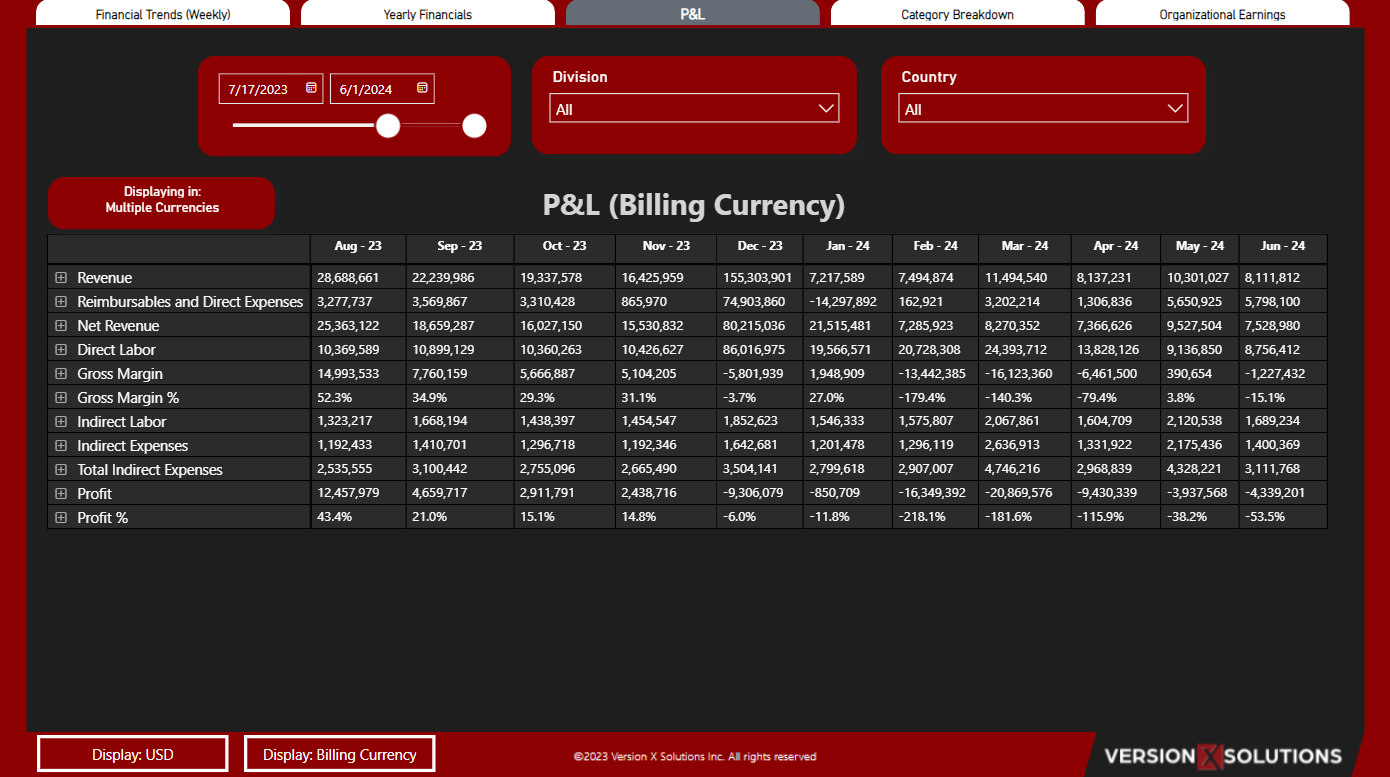
Our comprehensive Profit and Loss (P&L) dashboard provides an in-depth view of key financial metrics over a specified period, allowing for easy tracking and analysis of financial performance. You can customize your view by selecting the desired date range using the date toggle feature. Refine your data by selecting specific divisions and countries, providing targeted insights into different segments of your business.

The dashboard supports multiple currencies with easy toggles between displaying data in USD or the billing currency, offering flexibility for international financial management. This P&L dashboard breaks down data to the transaction level using a matrix table, providing a granular view of financial activities. It is customizable to fit how each firm structures their P&L, ensuring that the financial insights are tailored to your specific business needs. Explore this dynamic and interactive dashboard to gain actionable insights and make informed decisions that drive your business forward.

Organizational Earnings
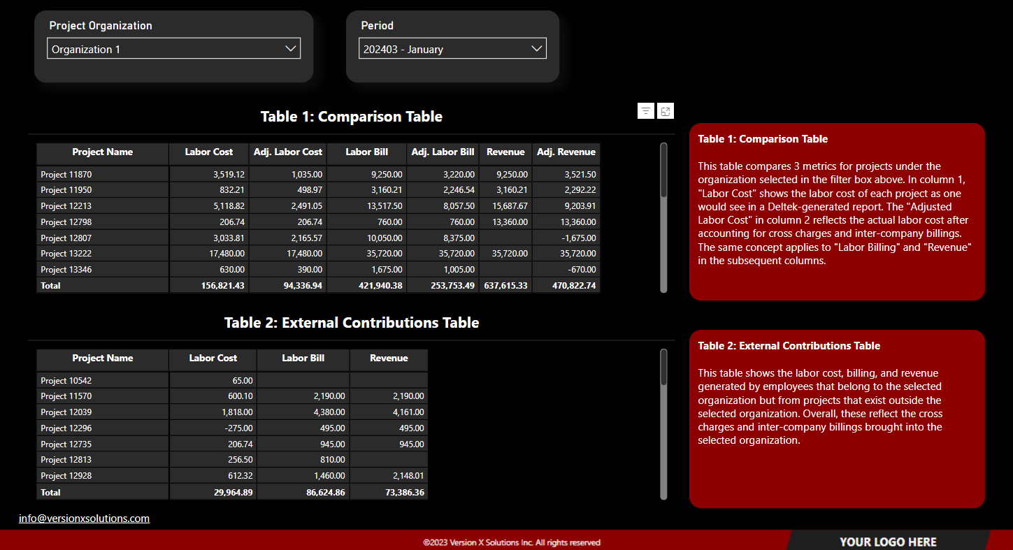
Table 1 compares 3 metrics for projects under the organization selected in the filter box above. In column 1, “Revenue” shows the Revenue of each project as one would see in a Deltek-generated report. The “LCC/IC Revenue” in column 2 shows the Cross Charges and/or inter company billings on that project. Column 3 “Adjusted Revenue, is the actual Revenue for that project when subtracting the Revenue that left (Cross Charges/Inter Company Billings).
Table 2 shows the Revenue generated by employees that belong to the selected organization but from projects that exist outside the selected organization. Overall, these reflect the cross charges and inter-company billings brought into the selected organization.
Weekly Financial Trends
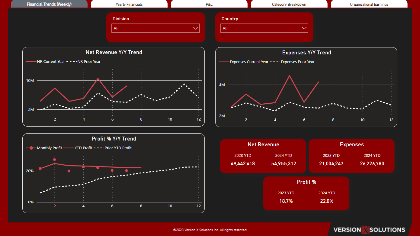
Our Financial Weekly Trends dashboard provides a visual representation of your organization’s weekly performance. This customizable dashboard fits each firm’s unique structure, ensuring tailored insights. Users can refine data by division and country for targeted analysis. Designed to offer a visual trend of weekly performance, the metrics can be customized to what each user wants to see.

The dashboard visualizes key financial trends, comparing the current year’s weekly performance to the previous year’s. Line charts highlight Net Revenue and Expenses year-over-year (Y/Y) comparisons and Profit percentage trends, showing significant changes and trends over the weeks. Summary cards provide quick insights into Net Revenue, Expenses, and Profit Percentage for the current and prior year-to-date (YTD).

Yearly Financials
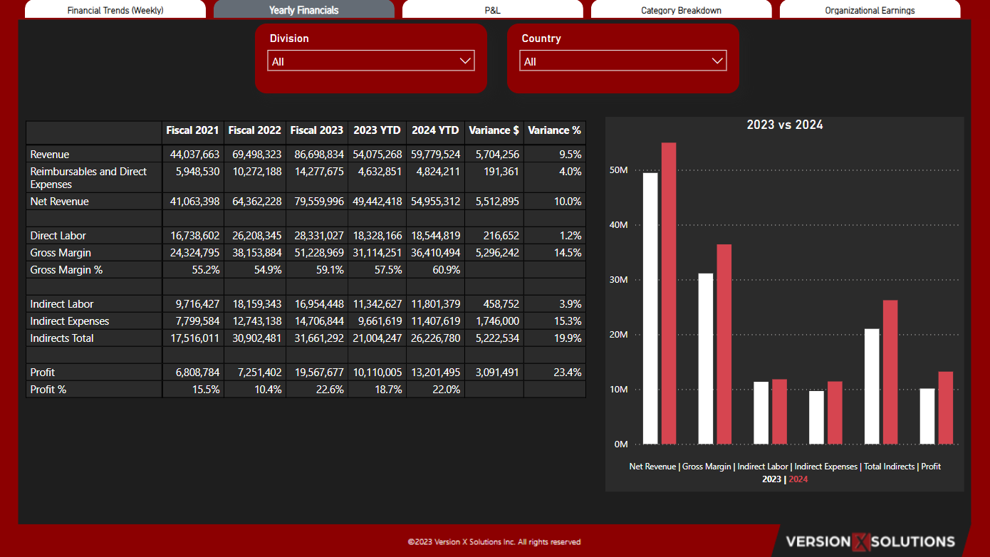
Our Yearly Financials dashboard offers a comprehensive view of your organization’s financial performance across fiscal years. This customizable dashboard fits each firm’s unique structure, ensuring tailored insights. Users can select the desired date range using the date toggle and refine data by division and country for targeted analysis.
The dashboard compares key financial metrics, such as Revenue, Net Revenue, Direct Labor, Gross Margin, Indirect Labor, Indirect Expenses, Total Indirects, Profit, and their respective variances. A bar chart visualizes the comparison between 2023 and 2024 for these metrics, highlighting financial trends.
